Click n Pay: same content, professional delivery.
A Perth halal meat marketplace had a genuinely good story — trusted local businesses, one online storefront — and a website that buried it under broken layouts and blank space. We rebuilt it with the exact same products, prices and story, and took it live in under a week. Then the marketplace we designed for them started filling up.
- Client: Click n Pay — online marketplace for Perth local businesses, launching with Swan Valley Meats (halal butcher, Herne Hill)
- Scope: Full website rebuild — brand refresh, 77-product catalogue, online ordering, domain migration — then two further storefronts added as the business grew
- Timeline: Working concept in a day · client said yes · live on their domain within the week · deli and catering arms added within the fortnight
- Live at: clicknpay.com.au
Before and after
One picture before the words. Left: the old site. Right: what's live today. Same business, same products, same prices.
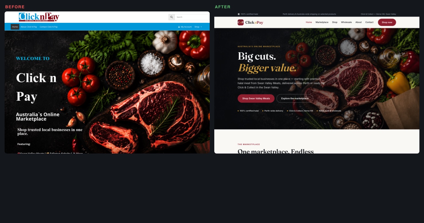
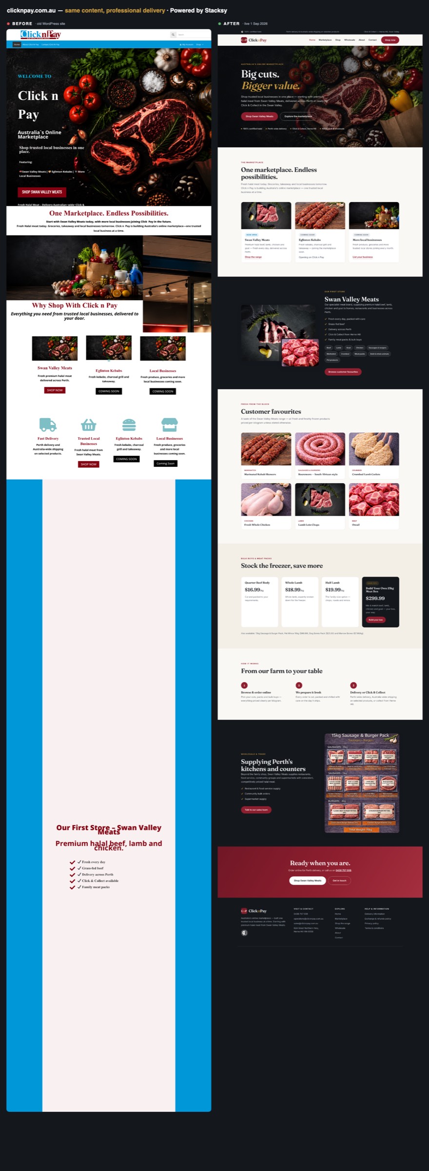
The full-page comparison is further down — the old site's most memorable feature was several screens of completely empty space.
The problem wasn't the business. It was the delivery.
Click n Pay came to us with a WooCommerce site that was working against them. Headlines with stray backticks and truncated words. Prices displayed European-style ("$49,99"). The same product carousel repeated twice on the homepage. And between sections, vast stretches of blank page where a theme had half-loaded and given up.
Here's the thing though: underneath all that was a real story worth telling. A family butcher with genuinely good products, fair prices, and an ambition — one marketplace where Perth's trusted local businesses sell together. The content was never the problem. The delivery was.
We didn't send a proposal. We sent the website.
Instead of a document describing what we could build, we built it. Within a day, a working concept was live on our private preview hub: refreshed brand (including a modernised logo that kept their colours but lost the clip-art), their full 77-product range photographed and browsable, their real prices — corrected to prices Australians recognise — and their marketplace story told properly, with their next retailer already slotted in as "coming soon".
The pitch email was one line of pricing options and a password. Clicking around a real, working version of your own website is a very different experience from reading a PDF about one. They said yes to launch within days.
What shipped
- Category-first shop. 77 products is a wall; 11 categories is a butcher's counter. Customers browse Beef, Lamb, Sausages & Burgers — each with photography, counts and from-prices — and search cuts across everything.
- Order requests without payment friction. A working basket that emails the itemised order straight to the shop — customer gets a confirmation, the butcher confirms weights and takes payment on collection or delivery. No gateway fees at a stage of business where every dollar counts.
- A brand that holds up. New wordmark and monogram built from their existing colours, applied consistently from the browser tab to the order-confirmation email.
- Launch engineering. Every old WooCommerce URL 301-redirects to its new home, so years of Google results still land somewhere real. Their Microsoft 365 email was untouched by the migration, and the new order emails pass SPF, DKIM and a strict DMARC policy — arriving in inboxes, not spam.
- Mobile-first. Most food ordering happens on phones. Tested down to small-screen widths, including the checkout.
The full transformation
Built to grow, priced in stages
The site launched as stage one of a roadmap the client chose from: a self-service product manager so their team can change prices without a developer; per-retailer onboarding as the marketplace grows; and a full marketplace platform — card payments, retailer order dashboards, delivery slots and SMS updates — when the volume justifies it. They started with exactly what they needed, and nothing they didn't.
Then the marketplace filled up
Within a fortnight of going live, the client opened a delicatessen at the front of the Herne Hill shop — cheeses, olives, pantry lines and hot food, with the butcher counter at the back. A few days after that, they launched a catering arm for parties, workplaces and community functions.
Both went onto the website in days, not months. That is the whole point of modelling a marketplace properly the first time: storefronts are a structure the site understands, not decoration hard-coded into a homepage. Adding a brand means adding a brand, not rebuilding.
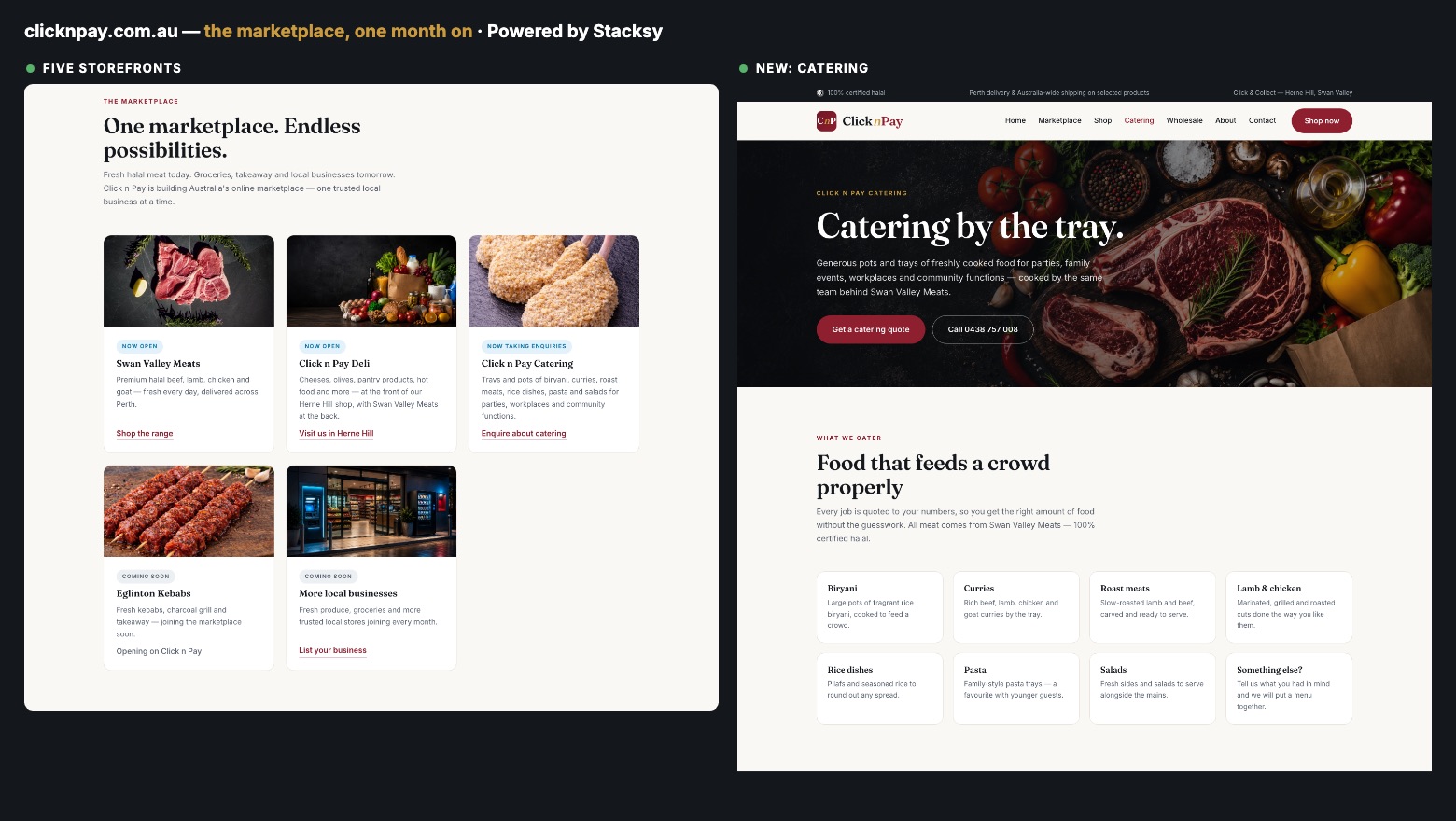
Five storefronts where there was one — and a catering arm with its own page and enquiry flow.
Catering: the right amount of technology
The obvious move would have been to bolt catering onto the existing shopping basket. We argued against it. Trays and pots for forty people aren't a click-and-pay decision — the price depends on the date, the headcount and the menu, and a form that quotes instantly would either underquote the client or frighten off the customer.
So catering is enquiry-first: the customer gives their date, numbers, event type and the dishes they're interested in, that lands in a dedicated inbox, and a human quotes it. Less technology than the shop, deliberately — because that's what the job actually needs. When the volume justifies instant pricing, the roadmap is there.
What we got wrong, and fixed
The launch build let customers order any cut, but only a kilogram at a time — fine for a test order, useless for a family buying five kilos of mince. The client flagged it, and within a day every per-kilogram product had a one-to-twenty kilogram selector with the price updating as you choose, kilogram quantities carried through the basket, the order email and the customer's confirmation.
Three brands also meant three inboxes: meat orders to the butcher, catering enquiries to the catering address, general questions to the office. Unglamorous, and exactly the sort of thing that decides whether a website is genuinely used by the business or quietly worked around.
What this tells you about how Stacksy works
Show, don't tell. If we think your website is underselling your business, we won't send you a slide deck about it — we'll build the better version and hand you the password. If it lands, we take it live. If it doesn't, you've lost nothing.
And the build doesn't stop at launch. The most useful thing we did for Click n Pay wasn't the rebuild — it was being reachable afterwards, so a new deli, a new catering arm and a fix to how meat is ordered all reached customers in days.
If your website reads like it's working against your business, that's exactly the conversation we like to start.
- The Discovery Program — how new projects start at Stacksy
- MyFaves — another small-footprint product done properly
- Visit clicknpay.com.au →